For a long time in the web development world, trying to vertically centre text or an element was the ultimate meme. People joked endlessly about how it took more time to vertically centre something with CSS than it did to build an entire website. Thankfully, times have changed, and modern browsers now give us a ton of ways to solve this problem.
Below, we'll explore the best and easiest ways to vertically centre elements in 2025. We'll start with the most modern approaches, then work our way down to some legacy methods you might still encounter in older codebases (or that you might need when supporting older browsers).
TLDR;
Today, in 2025, modern browsers have solved this issue with powerful, easy-to-use CSS tools like Flexbox and Grid.
- If you can choose, use Flexbox or Grid. They're by far the simplest, most robust, and most readable approaches.
- If you're dealing with older browsers, or have unusual constraints, you can still rely on absolute positioning with transforms or even fallback methods like
line-heightordisplay: table.
Option 1: Flexbox (Most Recommended)
Flexbox is the go-to solution for vertical centring in many modern projects. It's widely supported across all modern browsers, super versatile, and easy to use.
HTML Example:
<div class="parent-container">
  <div class="inner-element">Vertically Centered with Flexbox</div>
</div>
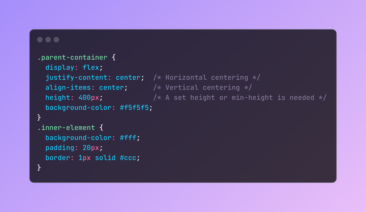
.parent-container {
  display: flex;
  justify-content: center;  /* Horizontal centering */
  align-items: center;      /* Vertical centering */
  height: 400px;            /* A set height or min-height is needed */
  background-color: #f5f5f5;
}
.inner-element {
  background-color: #fff;
  padding: 20px;
  border: 1px solid #ccc;
}
<div class="flex items-center justify-center h-96 bg-gray-100">
  <div class="bg-white p-5 border border-gray-300">
    Vertically Centered with Flexbox
  </div>
</div>
Why Flexbox?
- Simplicity: Just two CSS properties (
align-itemsandjustify-content). - Responsive-Friendly: It works great whether your container is large, small, or changes size.
- Browser Support: It's been well-supported for years.
Option 2: CSS Grid
CSS Grid has become another favourite for layouts. With a single property, you can centre items both horizontally and vertically.
HTML Example:
<div class="grid-parent">
  <div class="inner-element">Vertically Centered with Grid</div>
</div>
CSS Example (Plain CSS):
.grid-parent {
  display: grid;
  place-items: center;   /* This centers items both horizontally and vertically */
  height: 400px;
  background-color: #f5f5f5;
}
.inner-element {
  background-color: #fff;
  padding: 20px;
  border: 1px solid #ccc;
}
Example with Tailwind:
<div class="grid place-items-center h-96 bg-gray-100">
  <div class="bg-white p-5 border border-gray-300">
    Vertically Centered with Grid
  </div>
</div>
Why CSS Grid?
- Intuitive:
place-items: centerdoes it all. - Powerful Layout System: Grid is useful for complex layouts, and it centers content easily.
- Great Support: Modern browsers have excellent Grid support, too.
Option 3: Absolute Position + Transform
If you can't (or don't want to) use Flexbox or Grid, you can still centre an element vertically by combining absolute positioning with transform. This method works well in many browsers, but it's considered less straightforward than Flexbox or Grid.
HTML Example:
<div class="abs-parent">
  <div class="inner-element">Vertically Centered with Absolute Position</div>
</div>
.abs-parent {
  position: relative;
  height: 400px;
  background-color: #f5f5f5;
}
.inner-element {
  position: absolute;
  top: 50%;       /* Move the element 50% from the top */
  left: 50%;      /* Move the element 50% from the left */
  transform: translate(-50%, -50%);
  background-color: #fff;
  padding: 20px;
  border: 1px solid #ccc;
}
Why Absolute+Transform?
- Works with older browsers: Doesn't rely on Flexbox or Grid properties.
- More code: You have to carefully set
position,top,left, andtransform. - Less responsive: If the container resizes, you might need extra adjustments.
Option 4: Using Line-Height
This trick uses a container with a set line-height matching its height, then aligns text by using vertical-align: middle. It only really works for single-line text (unless you use extra styling or display: inline-block elements).
HTML Example:
<div class="line-height-container">
  Vertically Centered Text with Line-Height
</div>
CSS Example (Plain CSS):
.line-height-container {
  height: 100px;
  line-height: 100px;          /* Match the line-height to the container height */
  text-align: center;
  background-color: #f5f5f5;
  vertical-align: middle;      /* Only valid in certain display contexts */
}
Why Line-Height?
- Very old school: It's been around forever.
- Limitation: Works best for single-line text. Multi-line text or more complex elements can break the layout.
Option 5: Using display: table (Very Old School)
Another classic approach is to use display: table on the parent and display: table-cell; vertical-align: middle; on the child. This mimics how table cells naturally centre their contents vertically.
HTML Example:
<div class="table-parent">
  <div class="table-child">
    Vertically Centered with <code>display: table</code>
  </div>
</div>
CSS Example (Plain CSS):
.table-parent {
  display: table;
  height: 400px;
  width: 100%;
  background-color: #f5f5f5;
}
.table-child {
  display: table-cell;
  vertical-align: middle;
  text-align: center;
}
Why display: table?
- Used to be standard: Before Flexbox and Grid existed.
- Still 'works': But it's not recommended for modern layouts unless you're dealing with unusual legacy requirements.


